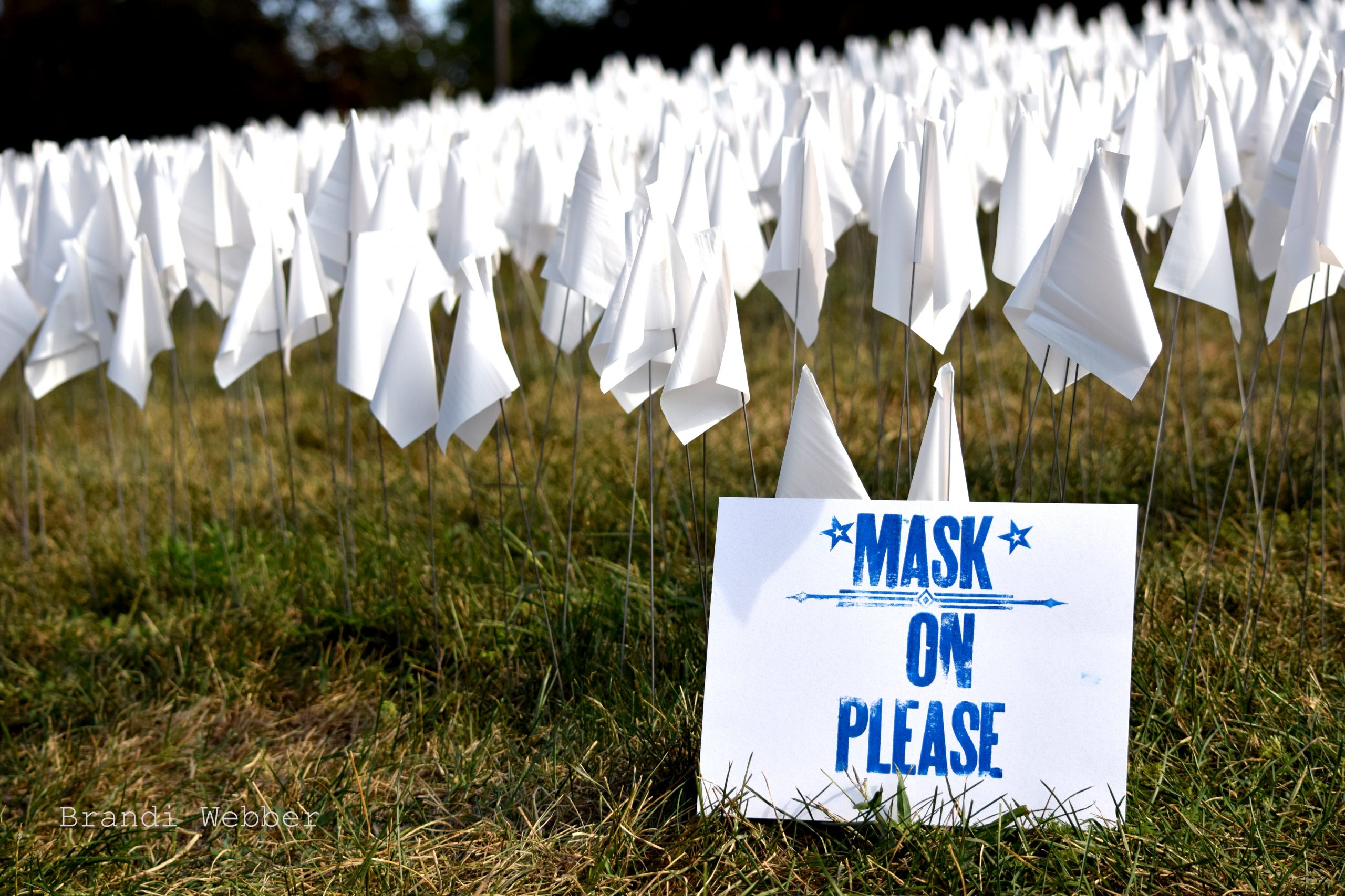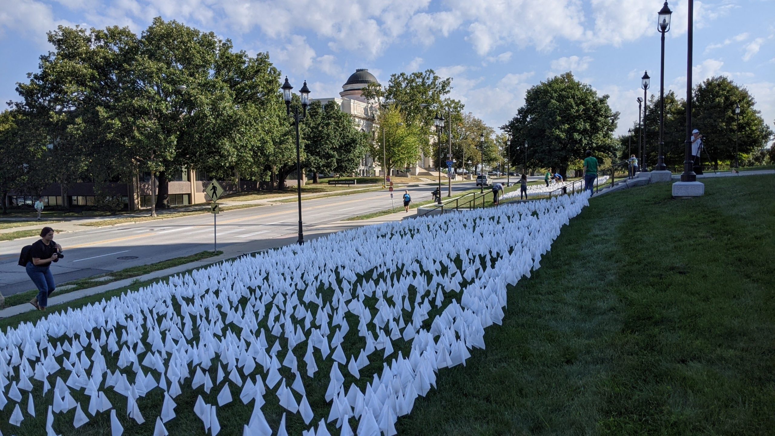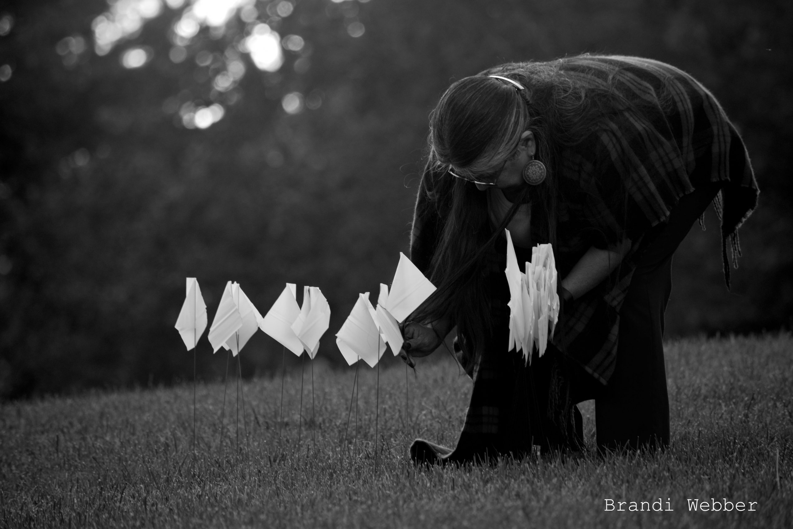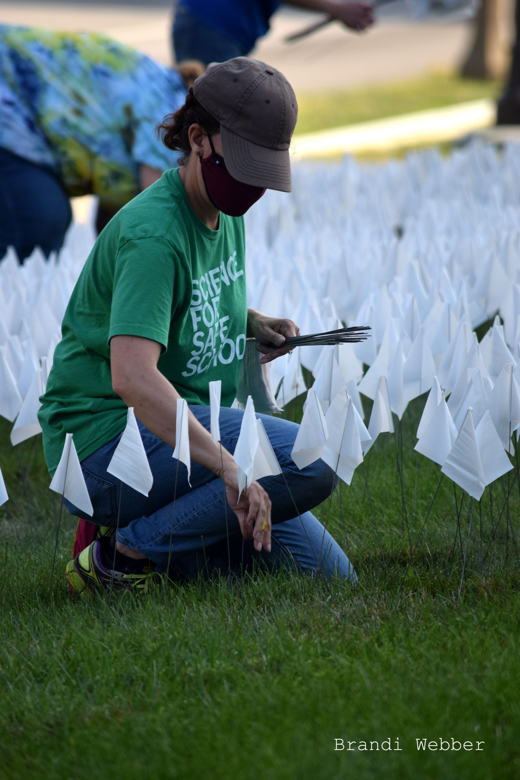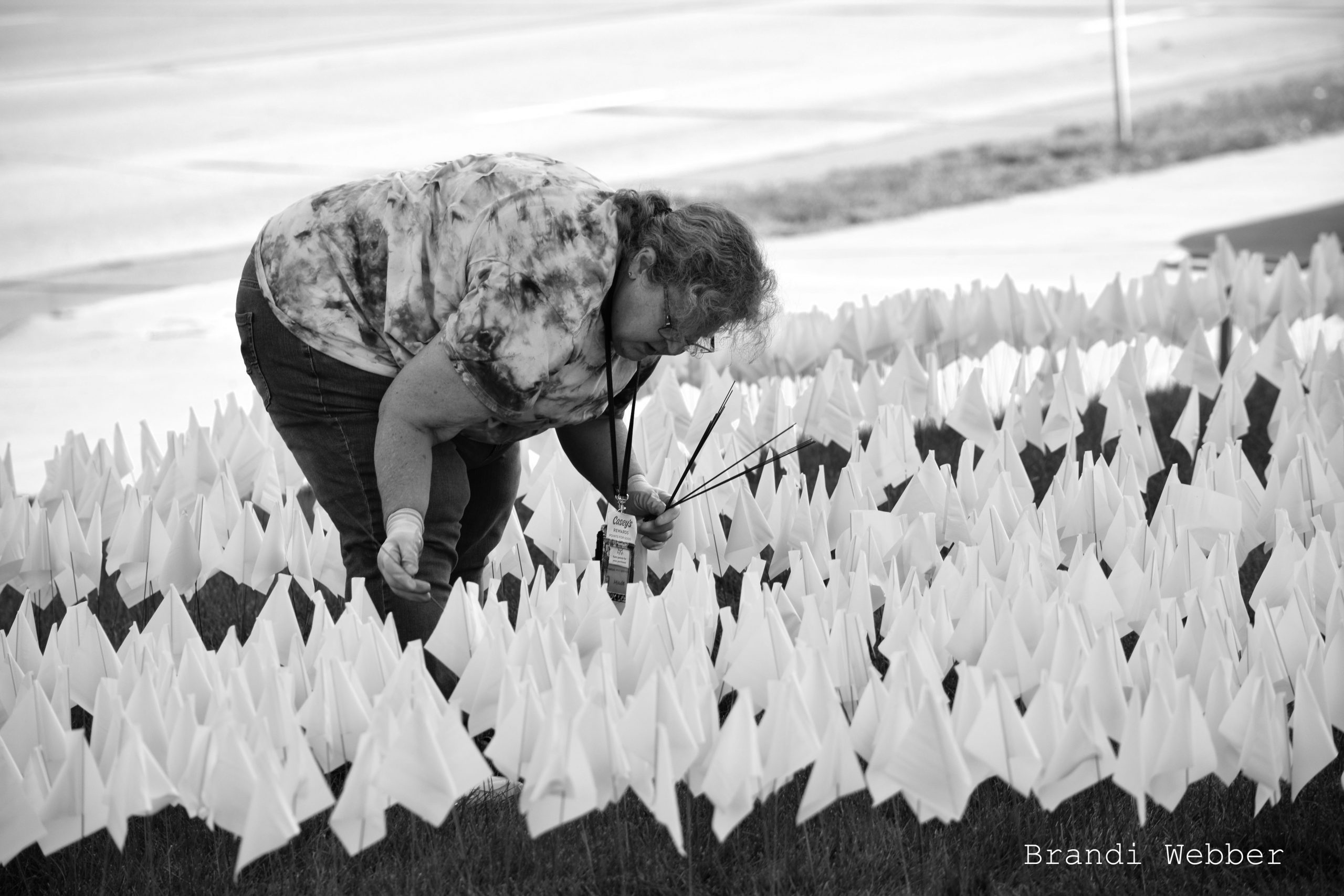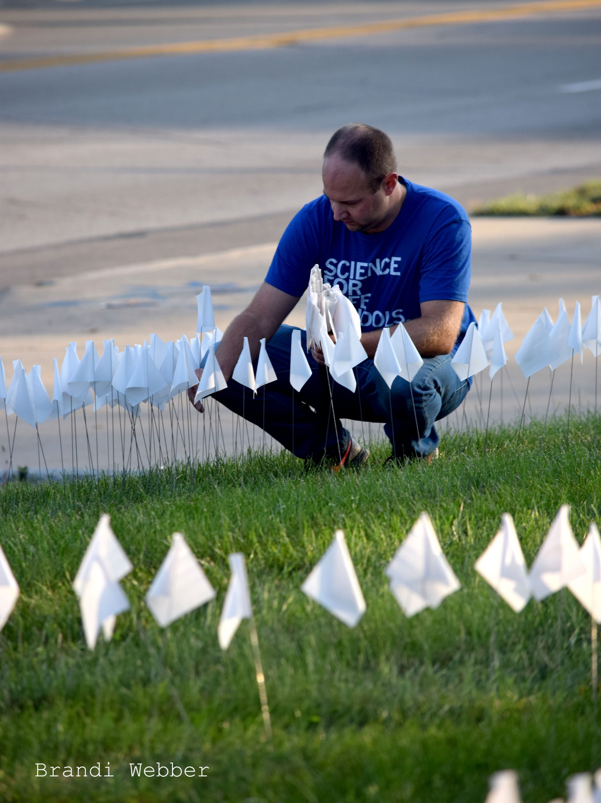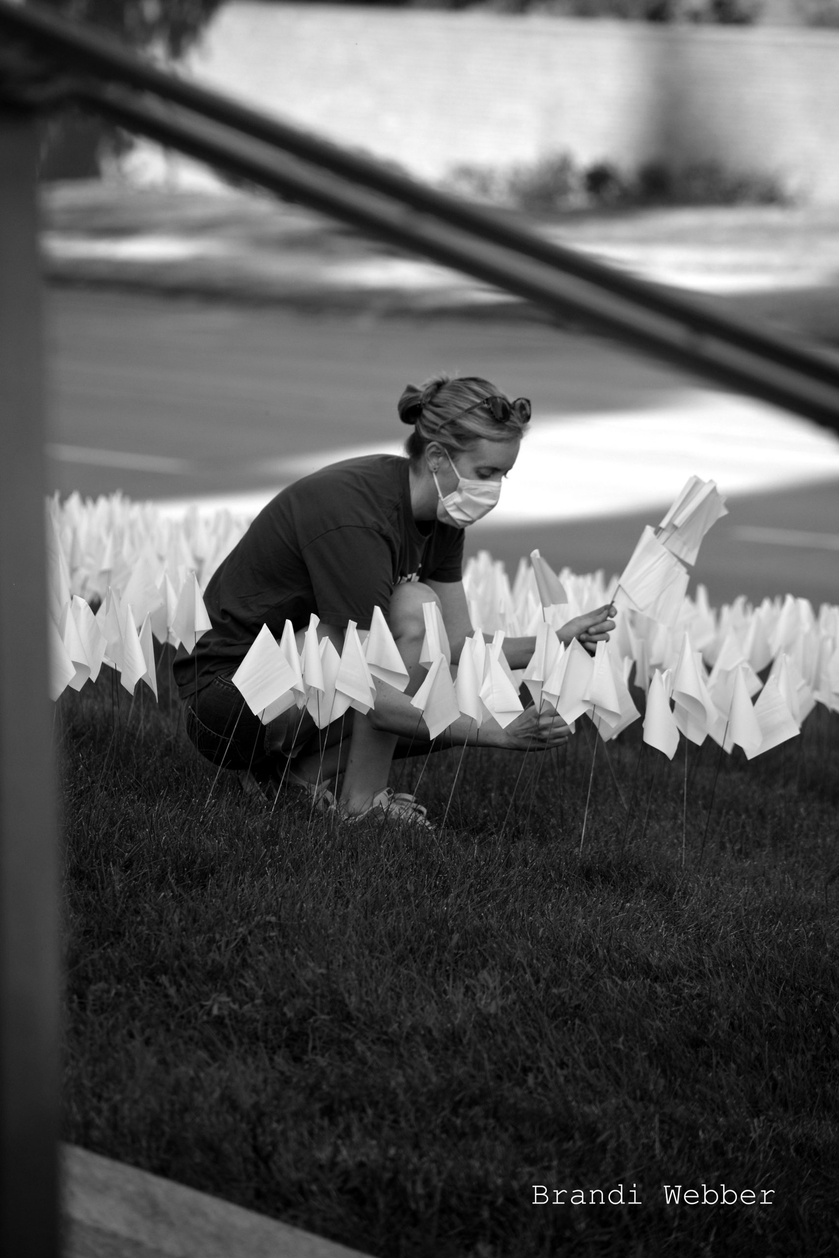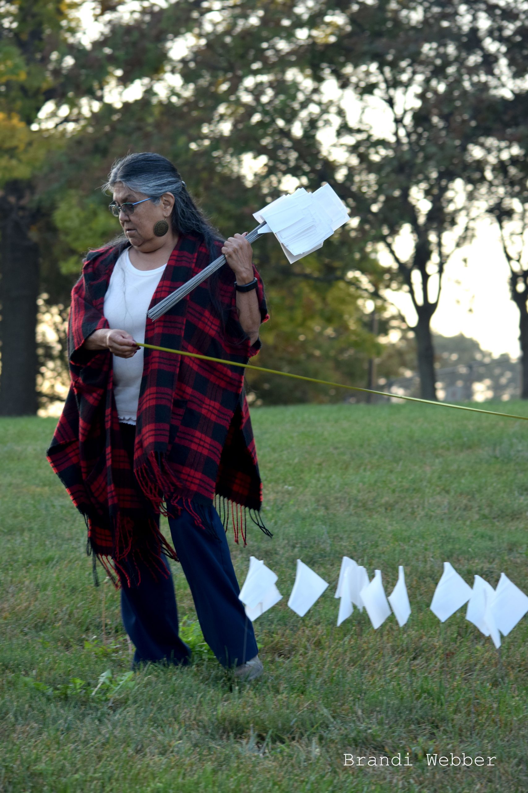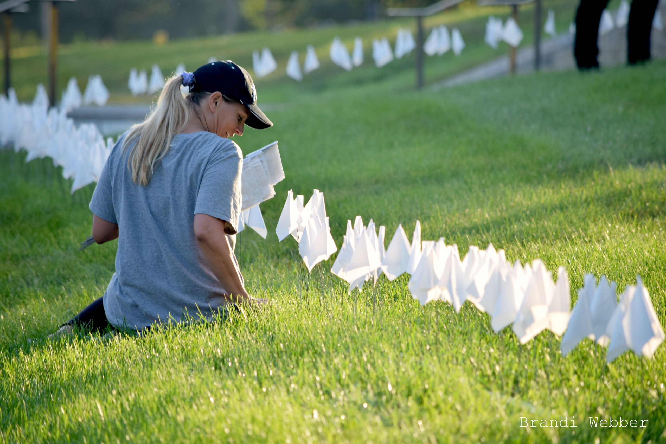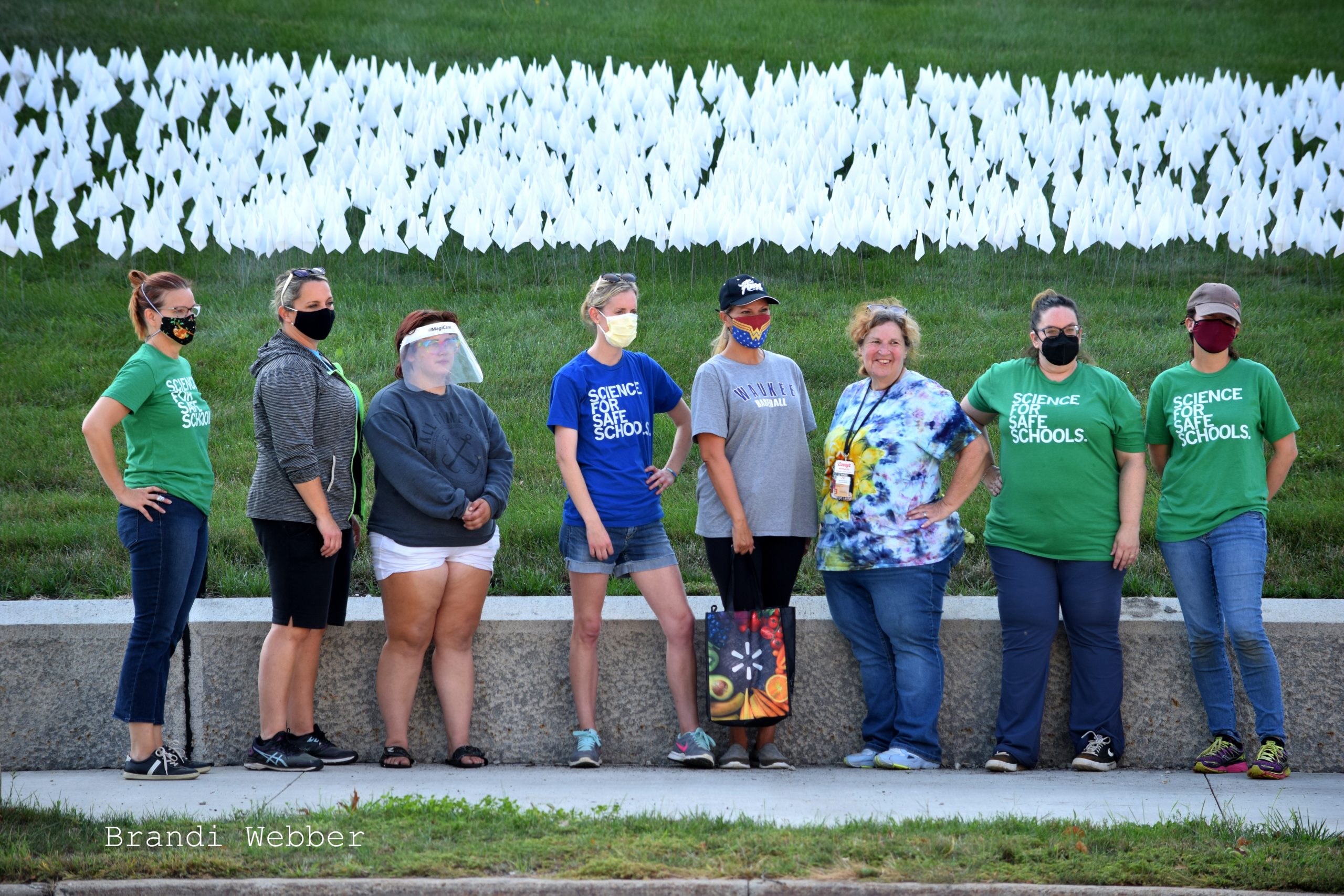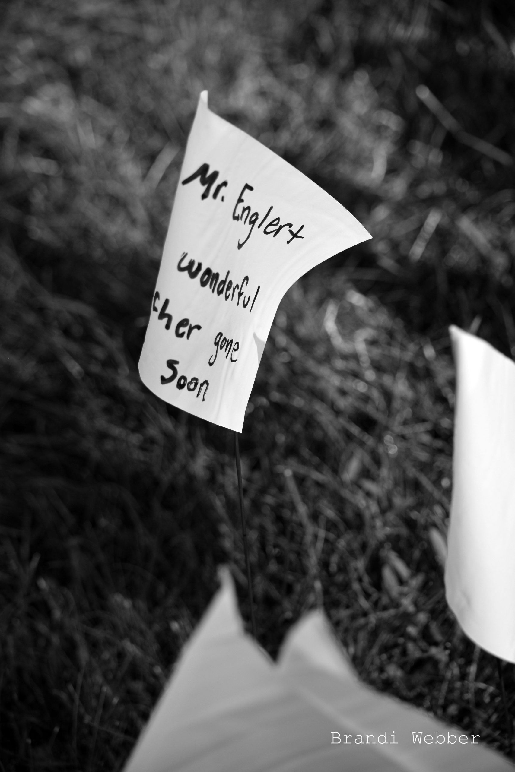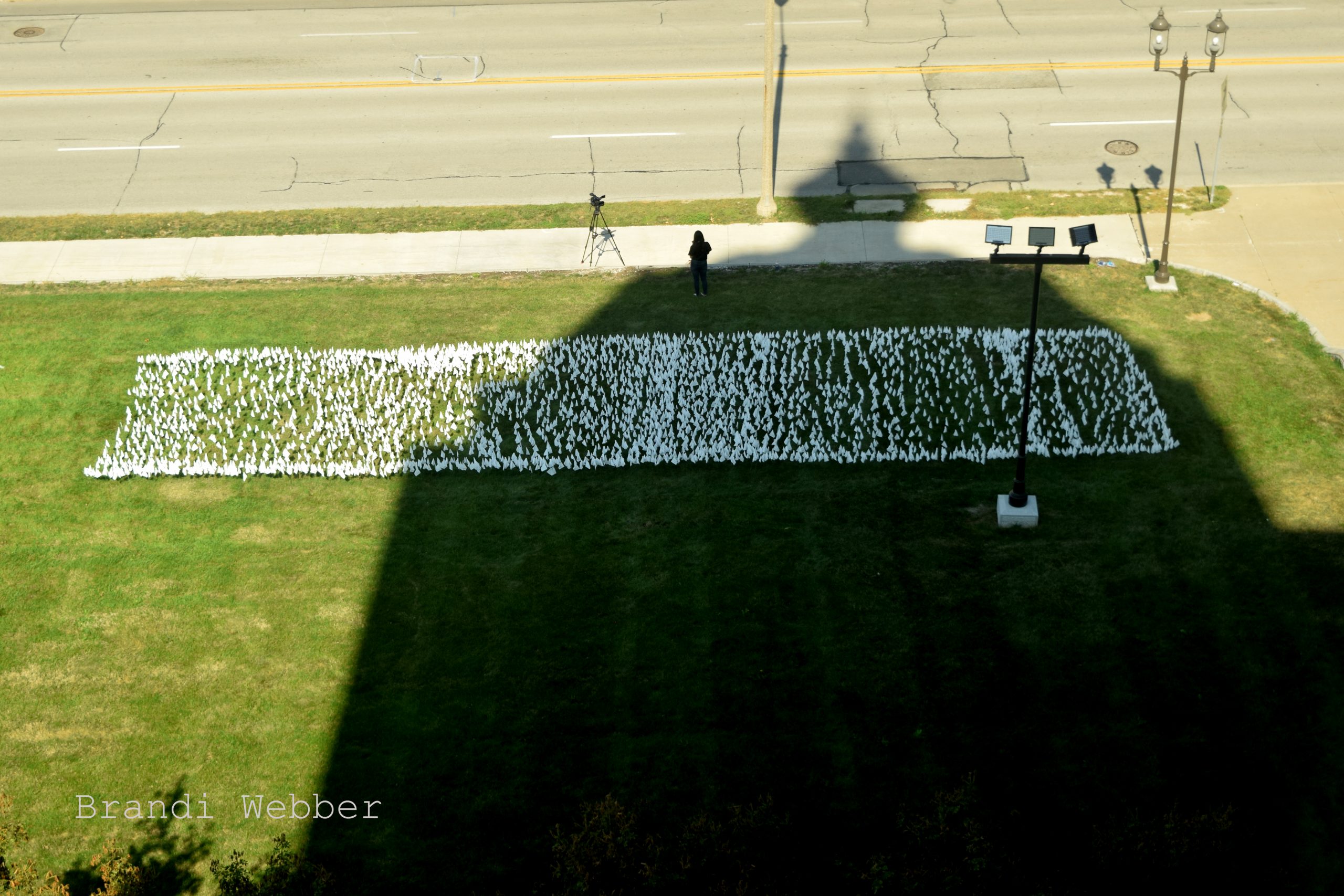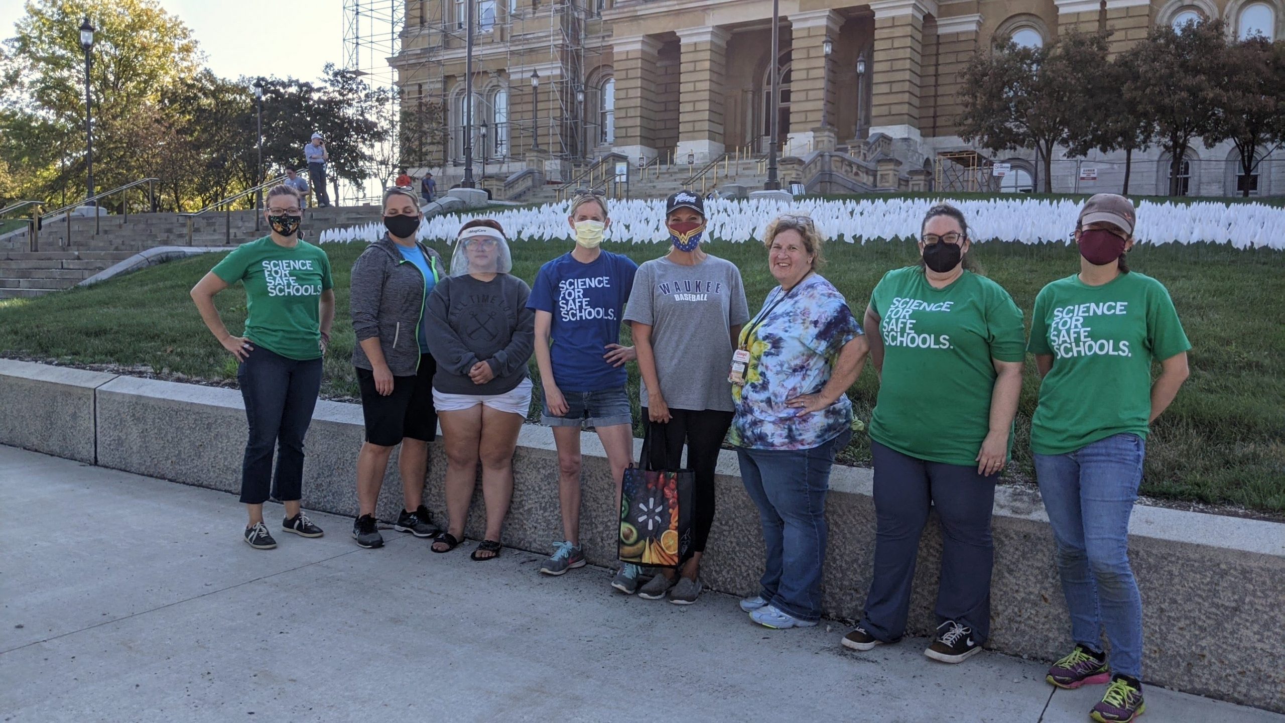
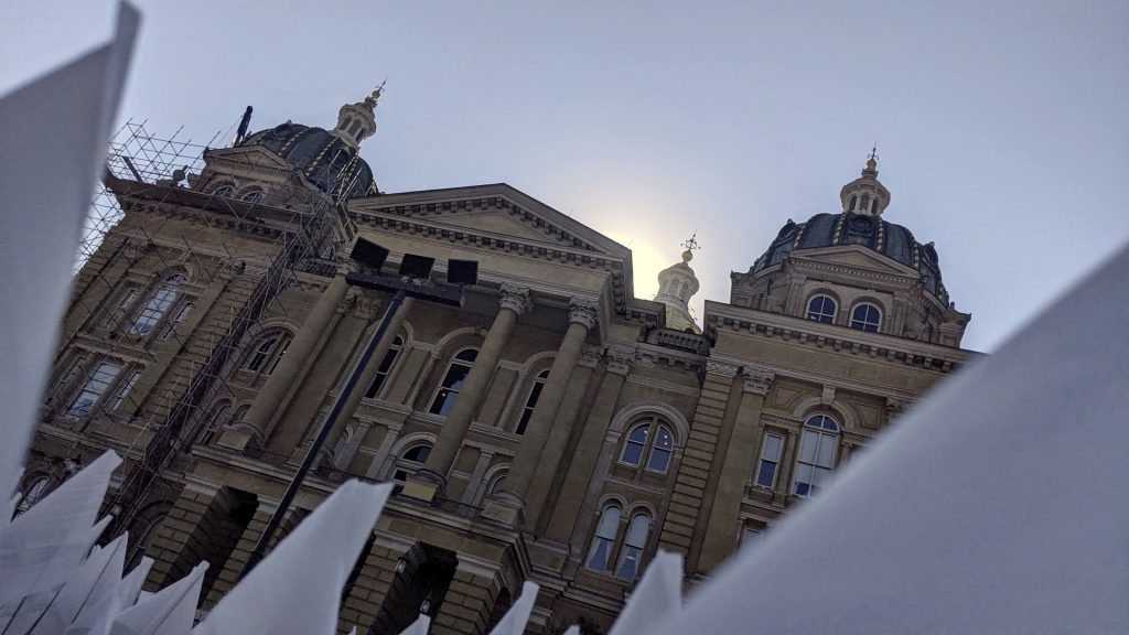
On Friday, Oct. 8, 2021 an Iowa Covid Memorial display of 7,000 (6,684 was official number of Iowans lost to Covid) white flags similar to the one that had just been displayed on the National Mall was on the lawn at the Iowa Capitol for the day. The pop-up event was hosted by the group of moms, Science for Safe Schools, who in August had organized the Safe at School Sit-In to protest the dangerous mask mandate ban, which prevented school districts from mandating masks. Artist/Activist Julie Russell-Steuart is part of this group, in her role as Chair of the Iowa Democratic Party Disability Caucus, advocating for kids and families with disabilities. The Sit-In event with 160 attendees on a record breaking hot Wednesday morning was widely covered in the media, including nationally. And Governor Reynolds was forced to respond. Julie’s narrative of the Sit-In can be found here on Bleeding Heartland.
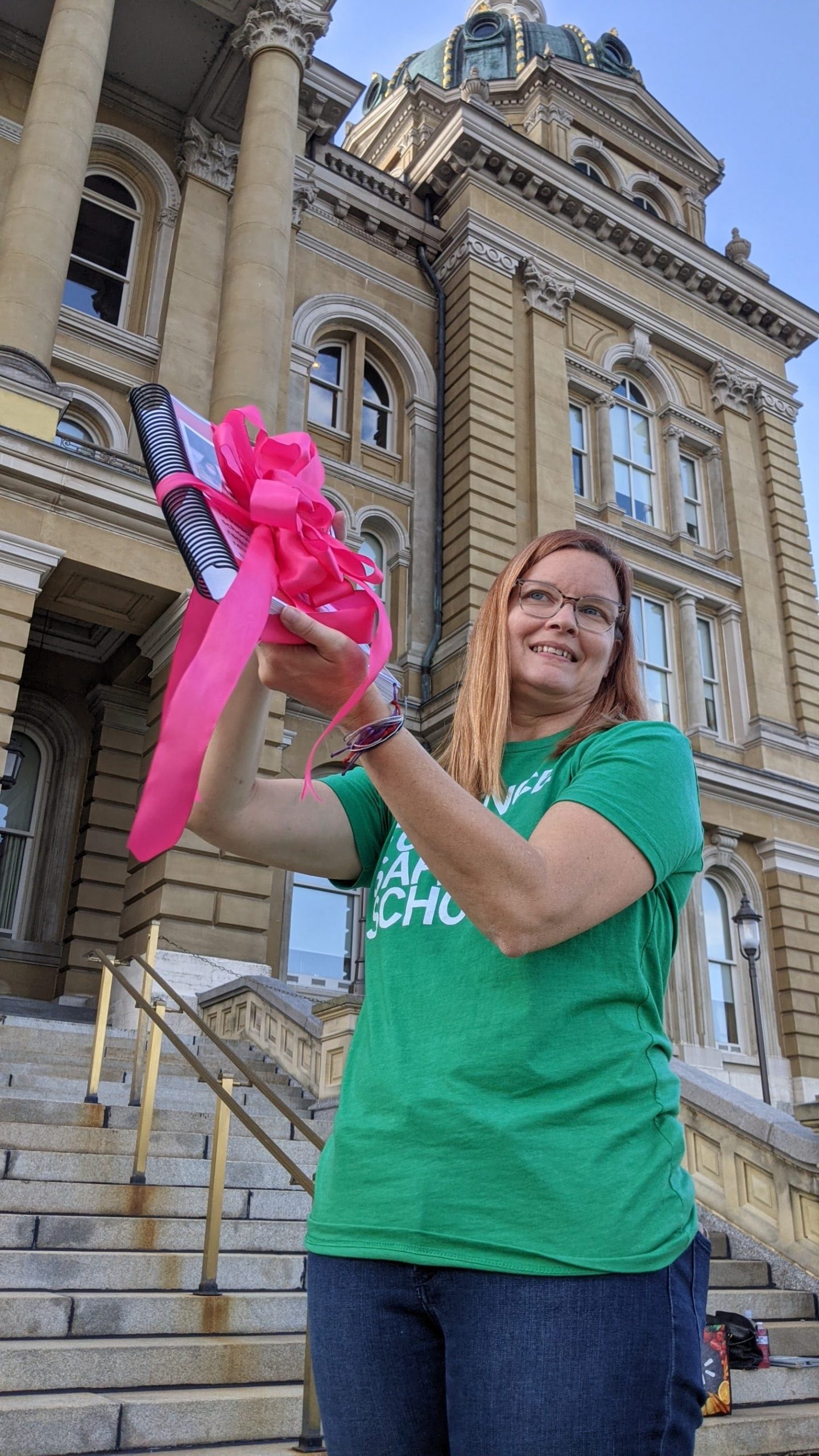
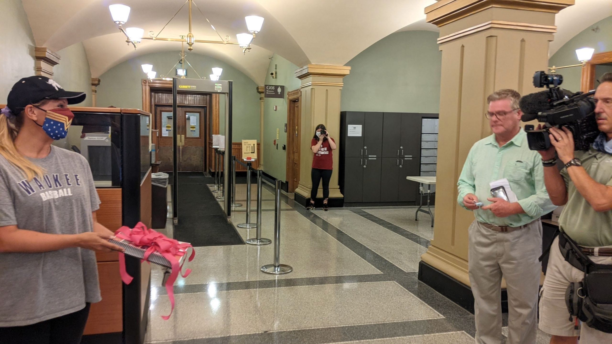
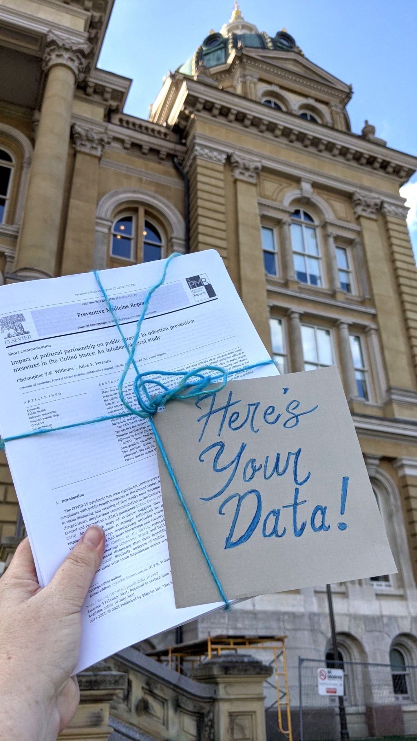
The group also delivered this petition to the Governors office, and added 200 pages of studies collected by Michelle Breitwisch, group member and pharmacist, that prove Covid mitigation tools like masks work. Governor Reynolds had repeatedly claimed not to have the “Data” on masking.
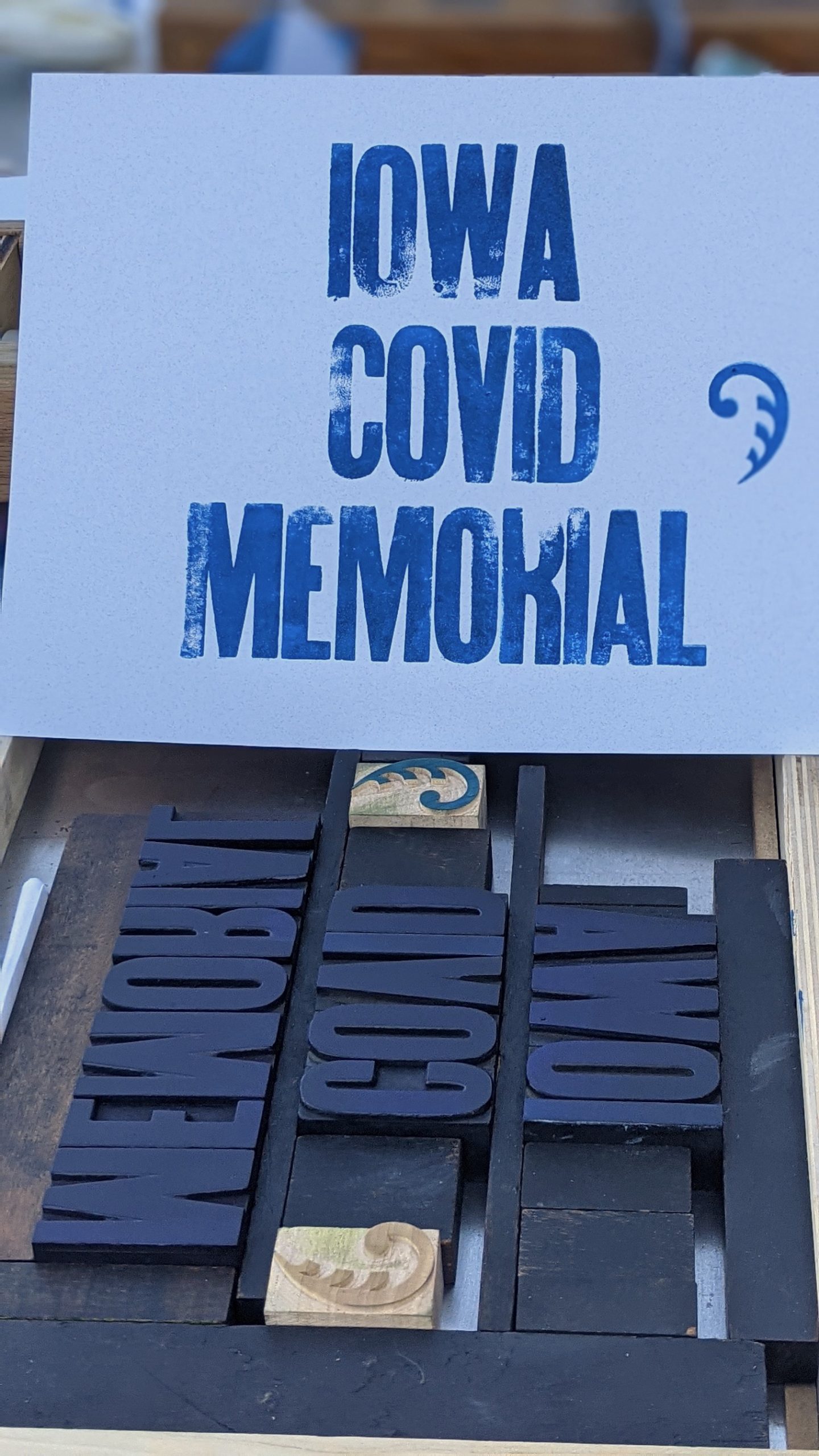
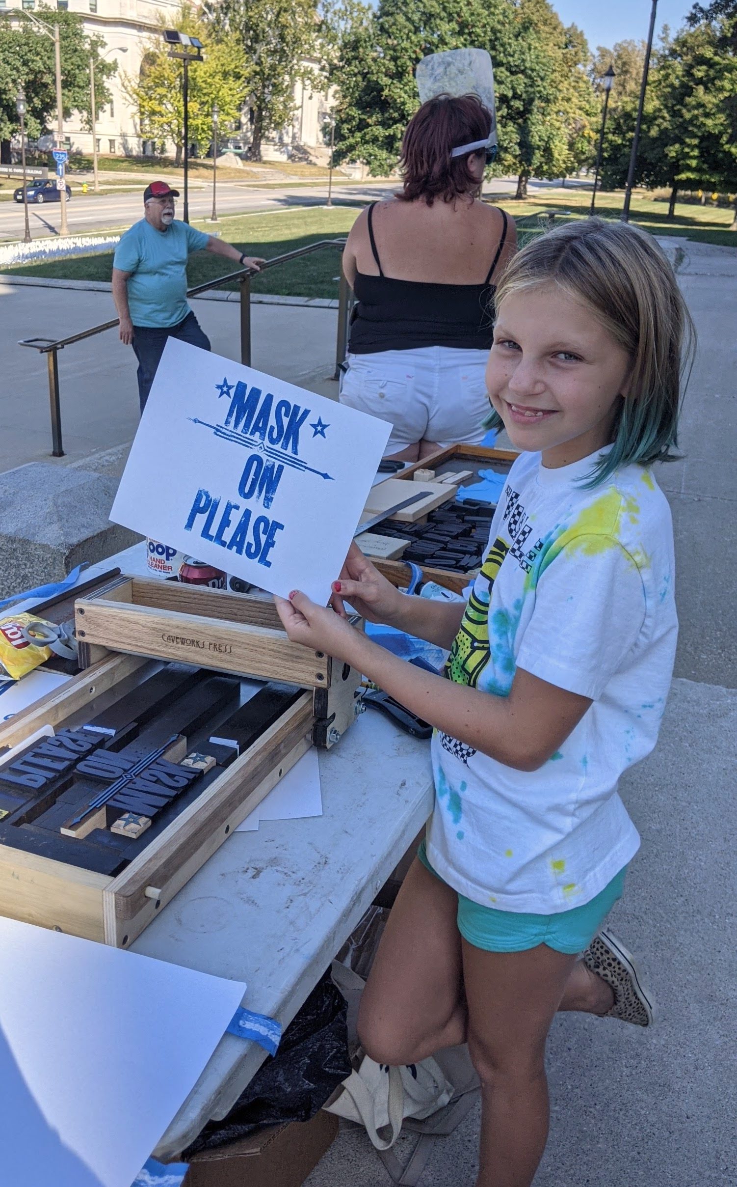
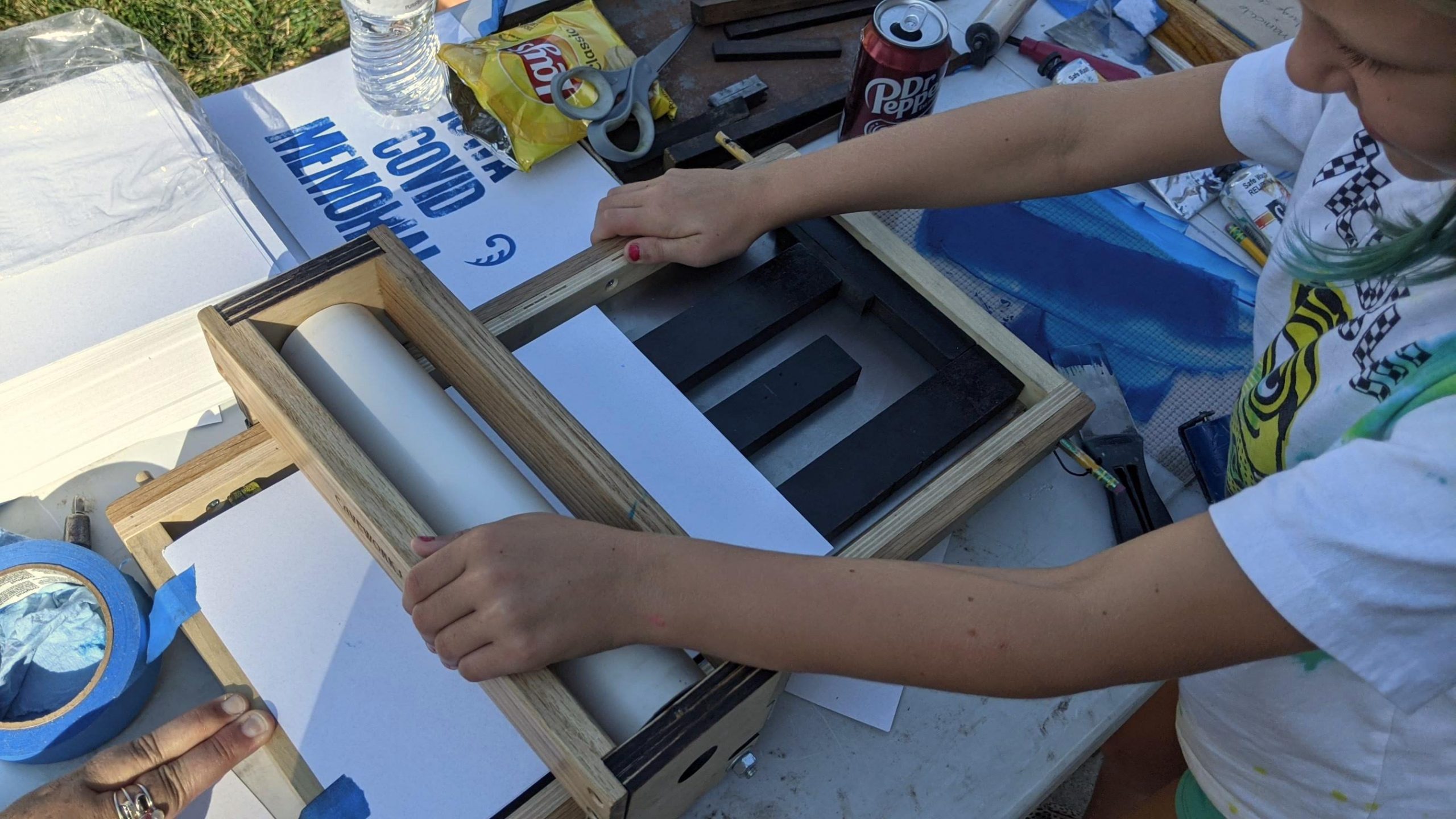
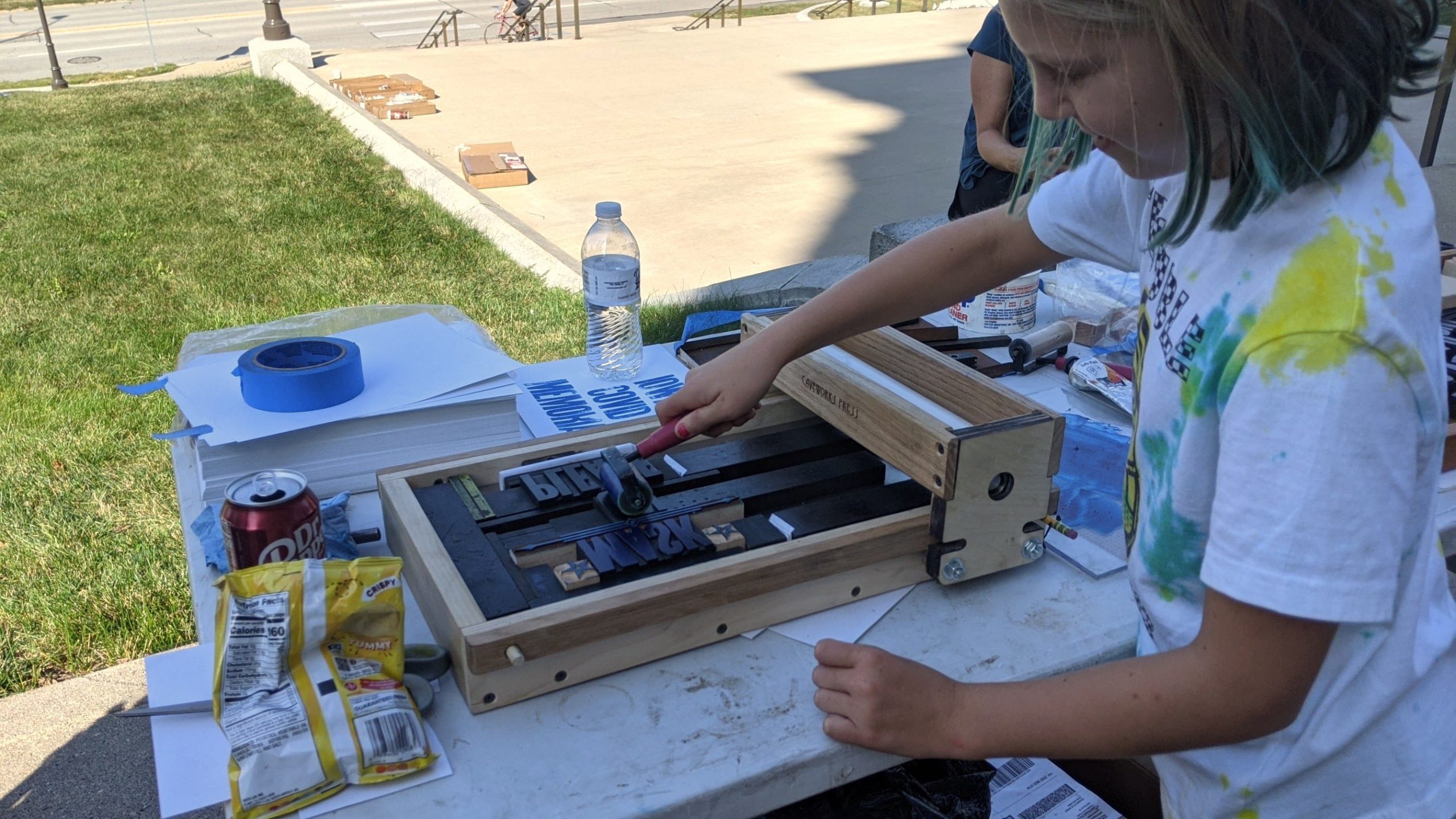
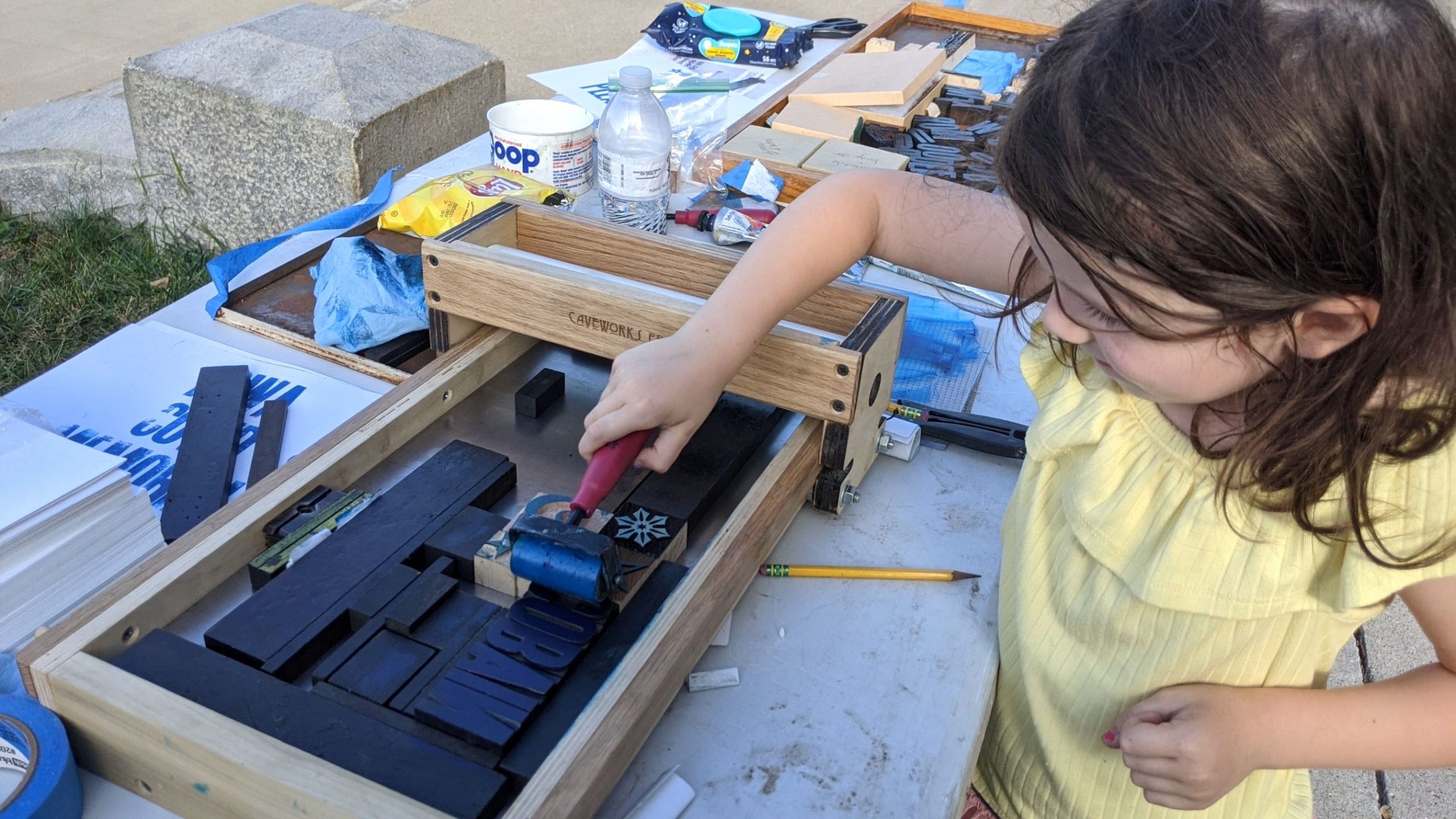
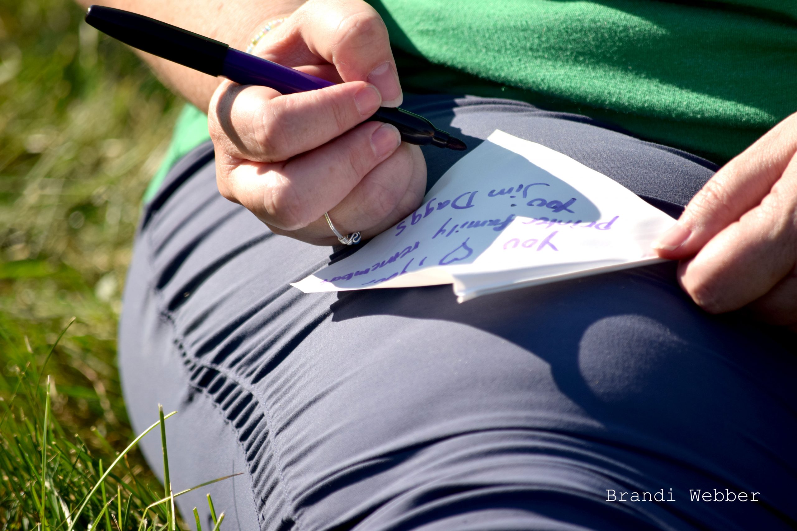
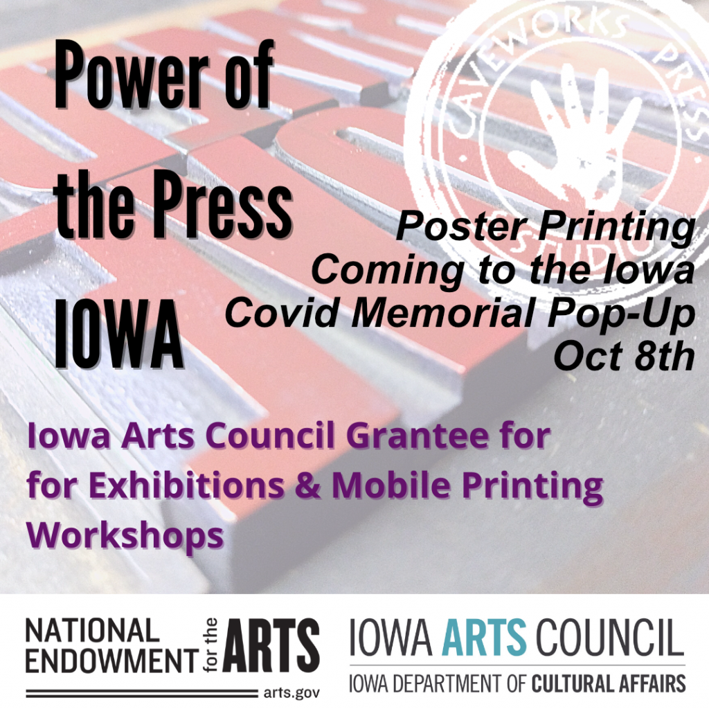
The artist hosted a Pop-Up Poster Printing at the Iowa Covid Memorial as part of her Artist Resilience Grant activity, funded by the Iowa Arts Council and the National Endowment fro the Arts. She brought her small proof press and worked with children to create posters on the fly with wood type from the late 1800s. This was the first time the press was used; it got a christening with the inky blue hands and the boundless curiosity of the children, and that was all right. Bella, disability activist Erin Dahl’s daughter, was a natural printer, and quickly fell into the process of setting type, locking up (think puzzles!) inking, and pulling a print.