New Poster- Broad Street Brewing Co.
Letterpress Art Poster $27.00. Limited number available.
BROAD STREET
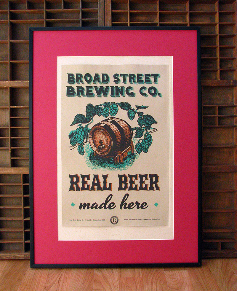
Earlier this year we produced a letterpress poster commission for local Reinbeck, Iowa business: Broad Street Brewing Co. It was exciting on several fronts. The folks behind the craft beer outfit are very proactive in buying locally. In fact, one of their goals is to locally source every ingredient for the beer they make. Trevor and Teeni Schellhorn are very supportive of hand-made goods in general and were excited about having me produce a (locally-made!) letterpress poster just for them.
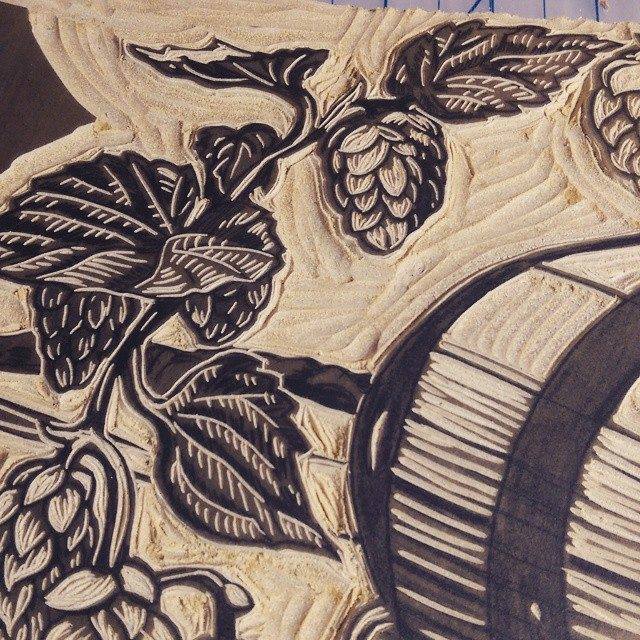
We decided to do a three color linoleum cut that references the hops for the beer, a special antique cask they own, and some cool retro typography, all of it hand-cut on linoleum blocks. The printing would take place on my hand-cranked Vandercook Universal II AB proof press.
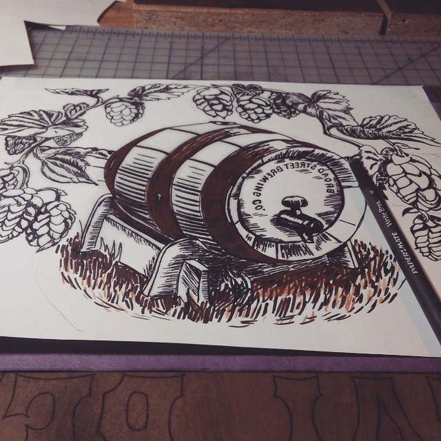
This was the first 3 color linoleum cut with separate blocks that I ever attempted. Sort of ridiculous, considering that I have cut plenty of one-color and a few reduction cuts. It was also really large, with a poster size of 12 1/2 x 19. The color choices were a vibrant green to summon summer (we planned this in February) a warm brown that was similar to a color they use in their marketing, and black to tie it all together.
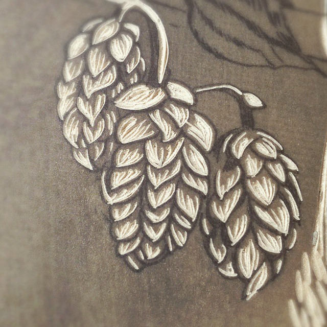
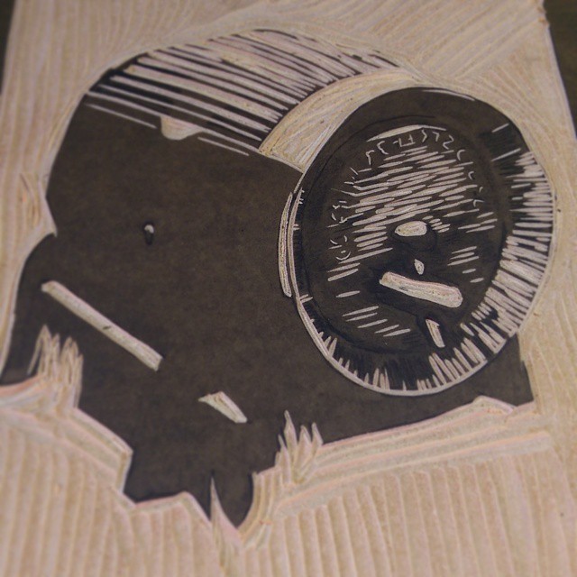
I looked at reference pictures of hops when I made my drawing by hand. Drawing has always been my first love as an artist and I was happy to be back in that place. I zipped over to the bar to take a picture of the antique cask, which became the reference for that portion of the drawing. Because I draw best things that are plant, animal, or human, I ended up using a tracing of the photograph of the cask. Straight lines and regular curves are just too hard for me. So the cask image was elaborated upon with made up shadows and light areas to simulate being outdoors in the sun. As I drew, I thought about what would be a brown cask color, what would be a black shadow, and what would be a brown highlight. Did I mention the paper we chose was a kraft brown? The highlight would be the paper color.
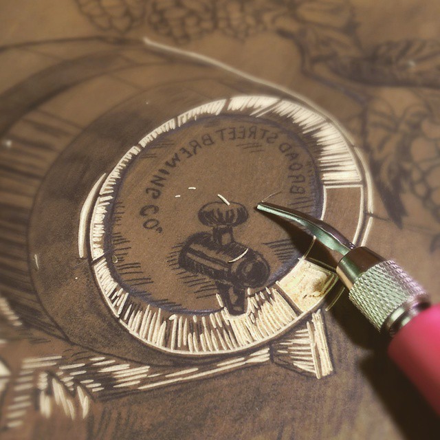
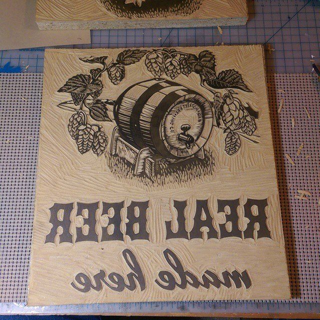
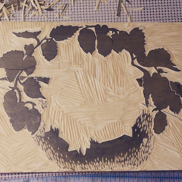
After the basic design was done, it was time to make the separate images for each color. These would be carved one at a time from linoleum. One image, the title “Broad Street Brewing Co.” would be printed twice in green then black. It was the lone image that enjoyed a single cutting and double color.
Now for the carving! What can I say? This is where I get into the zone. While I’ve got a darn good drawing (DGD; see acronyms for artists) it’s up to me at this point in time to make very critical decisions about what I am cutting and also what I am leaving. It’s what’s left behind that accepts the ink and is printed. However, it works both ways..a shape can be made by the absence. Normally this will be a highlight but it also extends to defining information, such as the veins on a leaf. Along with making a million tiny decisions while carving, I am also trying to maintain control and not send the cutter flying through part of the image that I want to keep. Mistakes at this point are very costly. I re-carved one entire block in this series because of that. Luckily it was not the image, but rather a typography one. I spend hours sitting and carving. I am exhausted mentally and a bit stiff in the neck and shoulders when I must stop. Stopping is good because you might need to eat. More importantly, you could make a mistake if you try to carve while you are just too tired.
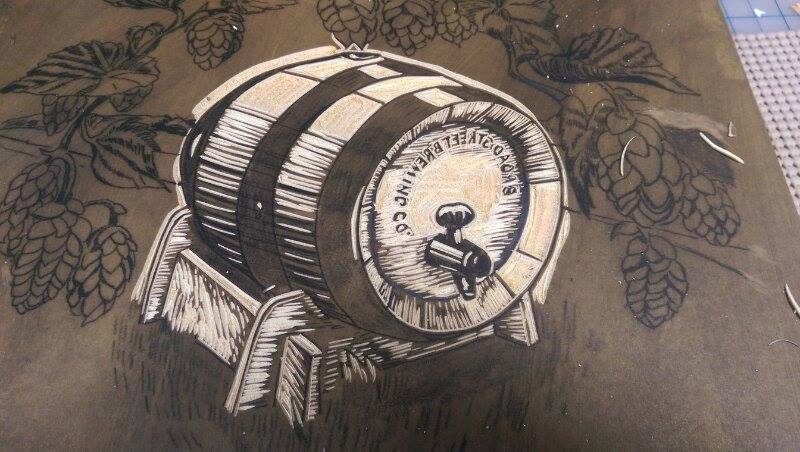
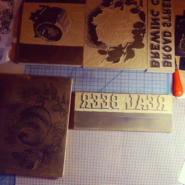
After the blocks were all carved…wait I forgot to mention that we made our own blocks with linoleum and particle board, or rather my husband was very kind to assist with his skills…
Printing time! After the designing, the drawing, the carving, this is the fastest part of the process. But this being the end result, it is no time to rush through any of it. Colors were tried out. The entire print was proofed in three colors to make sure everything was lining up right, and small changes were made to the blocks if needed. Positions were marked out on the press. These days I take photos with my cell as a memory aid to make sure I don’t lose my layout somewhere in my foggy brain.
The plan was to print the green elements first, then brown, then the final or “key” color, black. The reason it is called “key” is because when this color is printed, it’s like turning the key in the lock and opening up the door to see the final image. Everything falls into place. Or at least that is what one hopes.
All in all, I was very pleased with this print. It did everything I asked it to. And the folks at Broad Street Brewing Co. were thrilled. The poster debuted at the bar’s event MayFest at the end of May. My favorite beer is Black Porter. I also like the Coffee Stout, for obvious reasons for anybody that knows me.